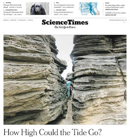
This weekly section marked a small, but noticeable, change for The New York Times print edition last week
If you have read any of my other posts on this blog, you might be aware that I am someone who is not a fan of change for change sake, especially when it comes to printed newspapers. Last spring, I called out my local paper, The Dayton Daily News, for making cosmetic changes to their publication that, in my opinion, were unwarranted and simply a ploy to placate their readership's current whims. In a follow-up piece, I expressed my displeasure with the folks at The New York Times Magazine for toying around with different fonts for its masthead in, what I hoped would be, a one-time experiment. I haven't seen any subsequent violations of that "sacrosanct" journalism symbol since, but you can imagine my surprise when I took yesterday's copy of The New York Times out of its protective plastic sleeve and saw the wholesale changes they made to the entire paper (minus the news section, the magazine and the Book Review).


